
Well seeing as we are all housebound until the apocalypse is over………..I have been doing spring cleaning, crafts, reading, scanning old slides and many other things to keep busy.
One thing I was doing was looking through photos and really liked some of my B&W photos. I got curious and started to compare the same photo done differently.
Now I personally don’t think all photos look great in Black and White, a lot depends on the subject and also the tonal range. The tonal range is how bright or dark parts of your photo are so that when you change to Black and White, it can be more dramatic if you do have those darker/lighter areas.
My program of choice is Lightroom. For years I used Photoshop and about 18 months ago, probably longer, I switched to Lightroom. Pros and Cons for both programs. I would love to have Topaz, a lot of people use it to sharpen their photos. Maybe one day, but it’s kind of pricey. And how do I justify yet another purchase of an editing software? So in the meantime, I’ll just hold my camera steadier lol
But that sharpening feature would be great, so many people I know use that.
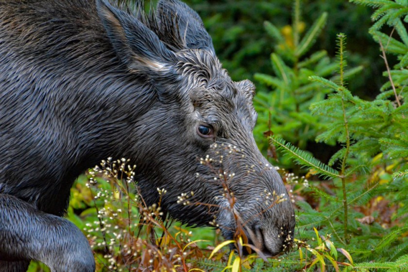
I took the photo of this moose in October 2019 in Algonquin Park and I really do like the Black and White. I did edit this moose in Lightroom and then used the B&W button to change him over. After that, I adjusted some lighting and shadowing to come up with the end result. Now I normally don’t care for anything being in the animals face, as these weed flowers are, but in the 2nd photo, I think it looks better. And in fact, the weed flowers look nice on his face. These are all my opinions, please feel free to disagree! It’s nice to know what other people like and don’t like.

Now in the photo below, I have not done any editing of any kind so it’s a little light on colour. I could have made it look a lot better had I tried lol
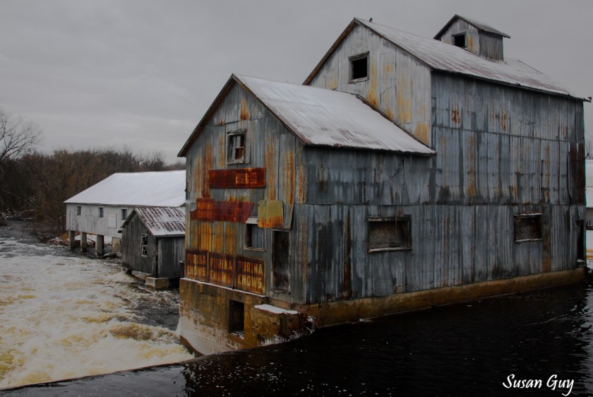
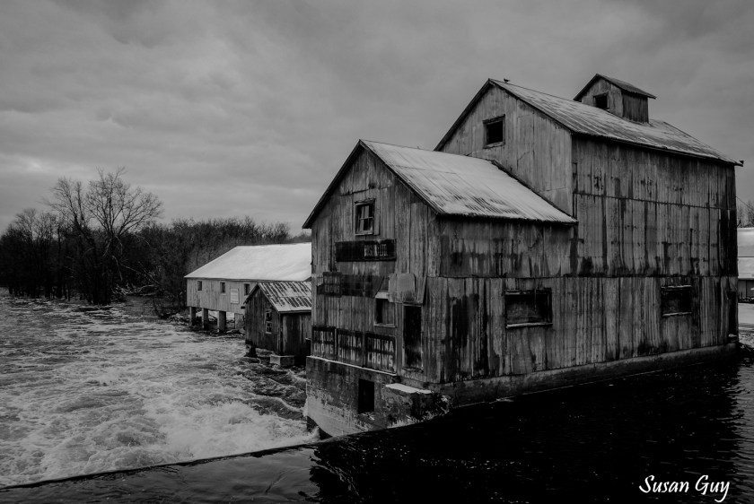
However, this was a day trip we took with one of our Photo Clubs and I wasn’t planning on doing anything with this photo. These were taken at Chisholm Mills January 2020.

So instead of editing in colour, I switched to Black and White and there you go…….
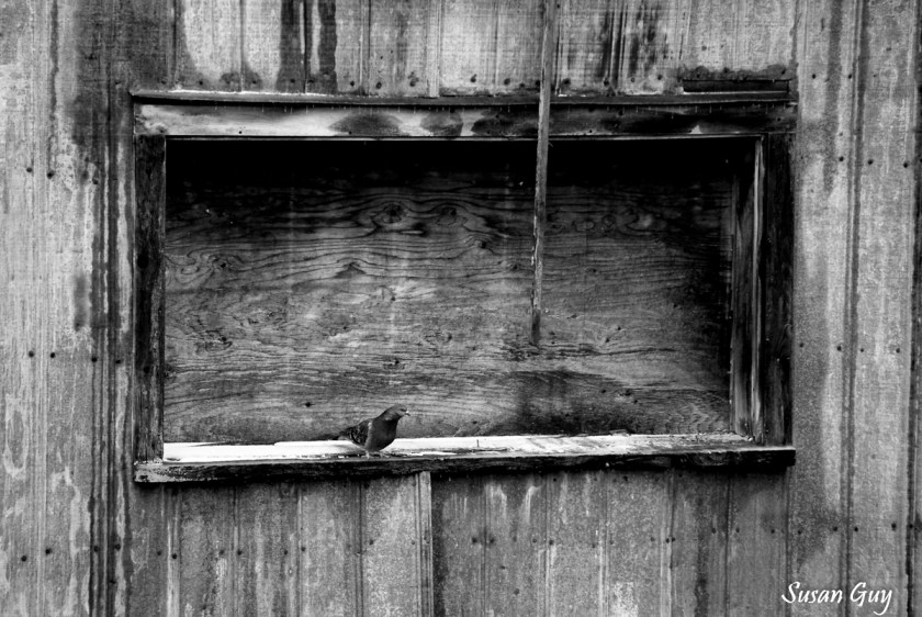
The next 2 photos are also of Chisholm’s Mill , I love this spot, you can get some really great photos. When I posted these next two on Facebook, more people did prefer the Black and White over the colour ….but boy it’s kind of a toss-up. I like them both
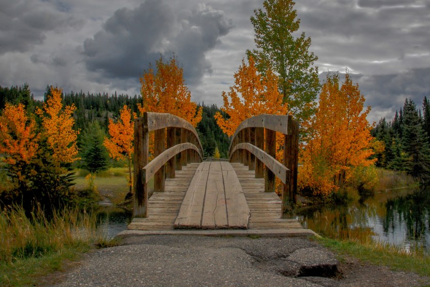
The photo below I took last autumn in the Banff area. The first photo is right out of the camera. (The 4 photos are the same spot but look different)

The next photo I did some editing in Lightroom. It’s a little brighter, more colour and I fixed the clouds. Now I’m not an expert in Lightroom but it doesn’t matter as long as I like it and I do like this one. I did crop the broken sidewalk out but it took too much of the photo out, so I just left it. These photos aren’t going to be used for anything so it doesn’t matter to me.
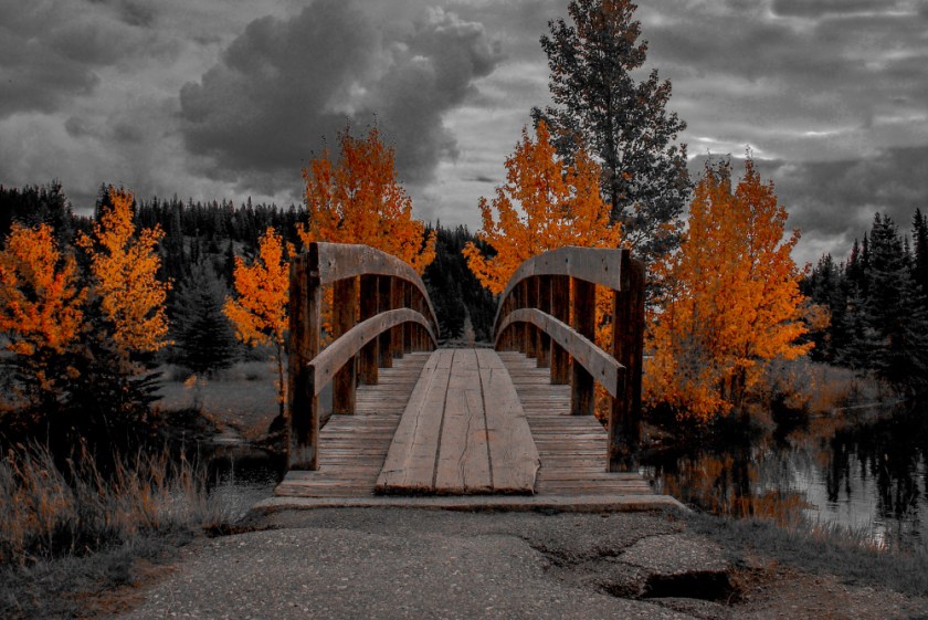
Of course, the next is Black and White. I think for this particular photo, I much prefer the colour version. As I said, a lot of subjects aren’t made for B&W. And some are……….What do you think?

Yup one more photo of the same scene. I was fooling around in Lightroom and I left this in colour but pushed the colour sliders all left except for orange. It’s a different look for sure. Like I said you can have some fun. Take a photo and try all the different options and see what you come up with. I’m not crazy about this one but I just like to try for different looks.
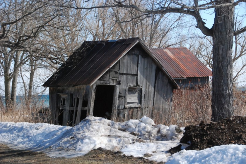
This was an old building in Prince Edward County we saw when we went for a drive one day. This is the original photo, right out of the camera.
But in the second photo I pushed all the colour sliders left and pushed the red colour slider up. It’s fun to play around in Lightroom when you have time, sometimes I like the results and sometimes I delete them. I have always liked B&W photos with a splash of red in particular.

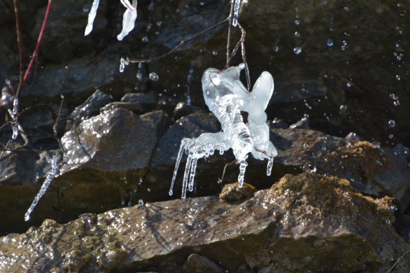
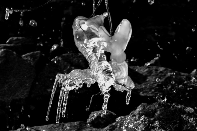
Ice can be cool……..get it? lol………anyways I liked the look of this piece. It reminds me of a flying bug of some kind. This is the original out of the camera.
A little cropping and changing to B&W and here you go ! It’s like a bumblebee in flight.
Another icicle, photo right out of the camera. This is not B&W, it is how it actually looked

You can do so much with Lightroom. I darkened the background which highlights the drops of water and as you can see in the below photo, even the texture changed. Now you can still edit after you switch to B&W, I usually always use the highlighting and shadowing features for sure and some others. Just use whatever until you get a look you like.

This is a spot up near Bancroft where you can walk down to a river and the chutes. Really pretty place. So the original photo contains lots of green colour and white snow.

But now……….still makes a good photo without any colour

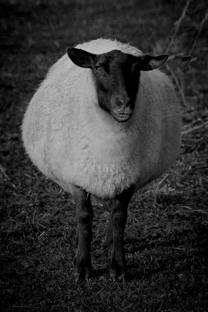
I am not always fond of animals done in Black and White however this sheep was a great candidate ! We found him on Amherst Island.

So as I said, it’s a matter of preference. I honestly can’t decide which photo of the sheep I like better but he does look pretty cool in B&W
Last photo ! This was on Amherst Island. I like simple, one object type photos.

I had these both printed out as I could not decide which I liked better………..

So if you do photography and have an editing program (Lightroom, Photoshop etc) try something different if you haven’t already. It can be fun to see what you can come up with.
Thanks for reading………..

I love all the original right out of the camera ones on all. Don’t like enhancements. One almost looks like a painting, not a photo and I don’t think that is what anyone would have in mind.
LikeLiked by 1 person
I mostly agree with that Debbie. I like to look at a scene, or animal, and have the same thing come out of my camera. If someone shows me a scenic shot of somewhere I don’t want to be surprised or disappointed when I see it in person and the colours are different! You know what I mean? But I do like playing around with photos and I do like B&W, (for some photos)………I really love to hear everyone’s opinions too! Hope you’re doing okay, I miss seeing you.
LikeLike
I generally prefer the photos as they are – using all those different editing programs is a bit like cheating on an exam for me.
LikeLiked by 1 person
You know in a lot of ways, I agree with you. You can be the worst, or the best, photographer, but using editing programs, particularly Topaz can make anyone’s photos look perfect. I do however like to transpose some of my shots to B&W, they can be a bit more dramatic and also kind of timely you know? Thank you 🙂
LikeLiked by 1 person
I think some black and white photos can be stunning, but generally I prefer colour!
LikeLiked by 1 person
I agree!
LikeLike
It seems that the animals and nature are better in color. Where the building and ice are more striking in B&W. Personal opinion of course and thank you for posting.
LikeLiked by 1 person
Yes I think you’re right, I do prefer animals in colour. I think buildings particularly old ones can be more dramatic in BW😊. I appreciate your thoughts also!
LikeLiked by 1 person